PureStorage is the first enterprise Flash-based storage company. I worked with them to create the user-interface that could expose and make understandable the complex controls that power their server solutions. I also created a set of standards and guidelines to document how the PureStorage identity should be used on product hardware and throughout marketing collateral as well as the interface design.
Tthe project was to really understand all the different ways to look at information about storage and what could be controlled - then organize it.
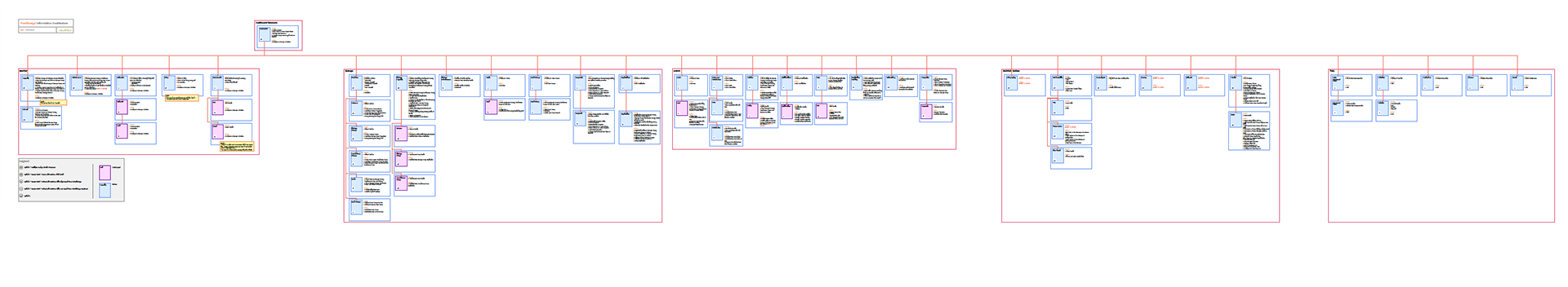
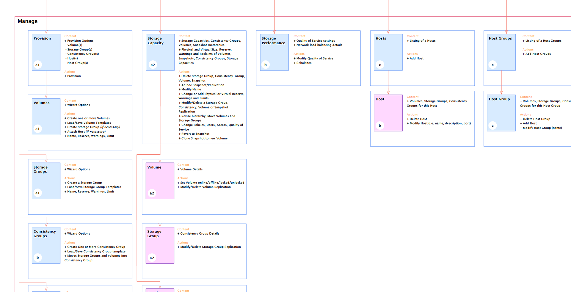
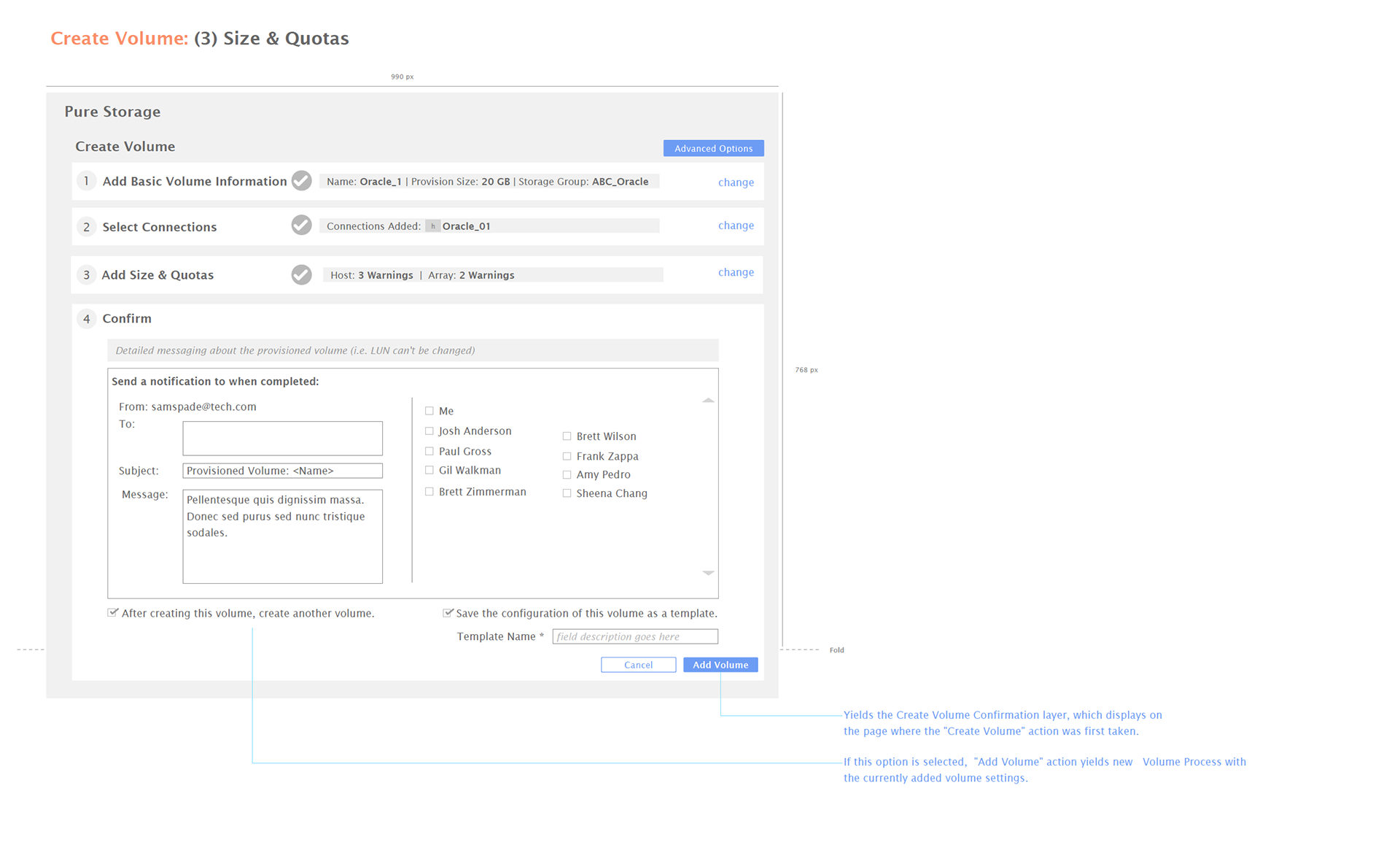
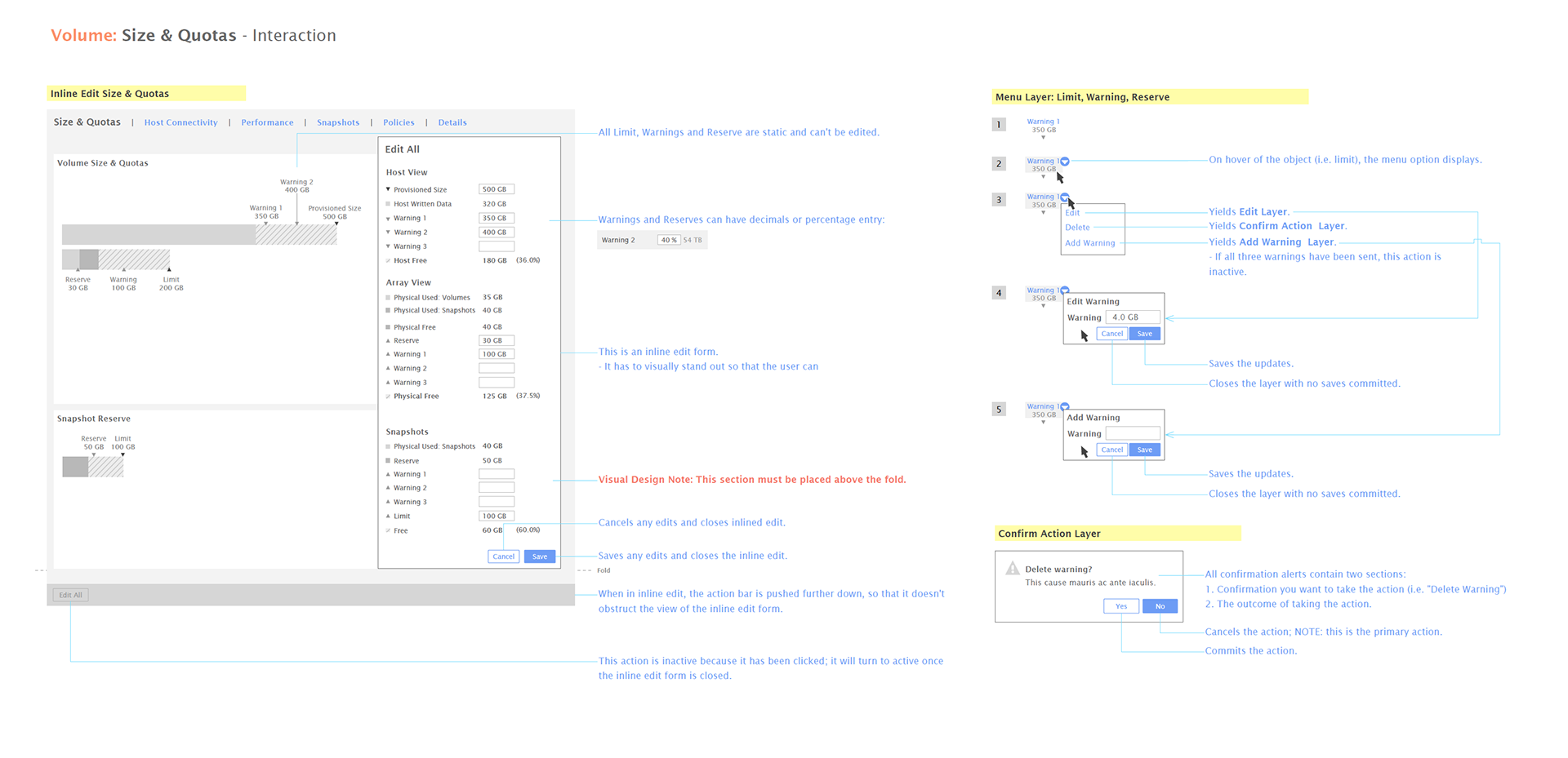
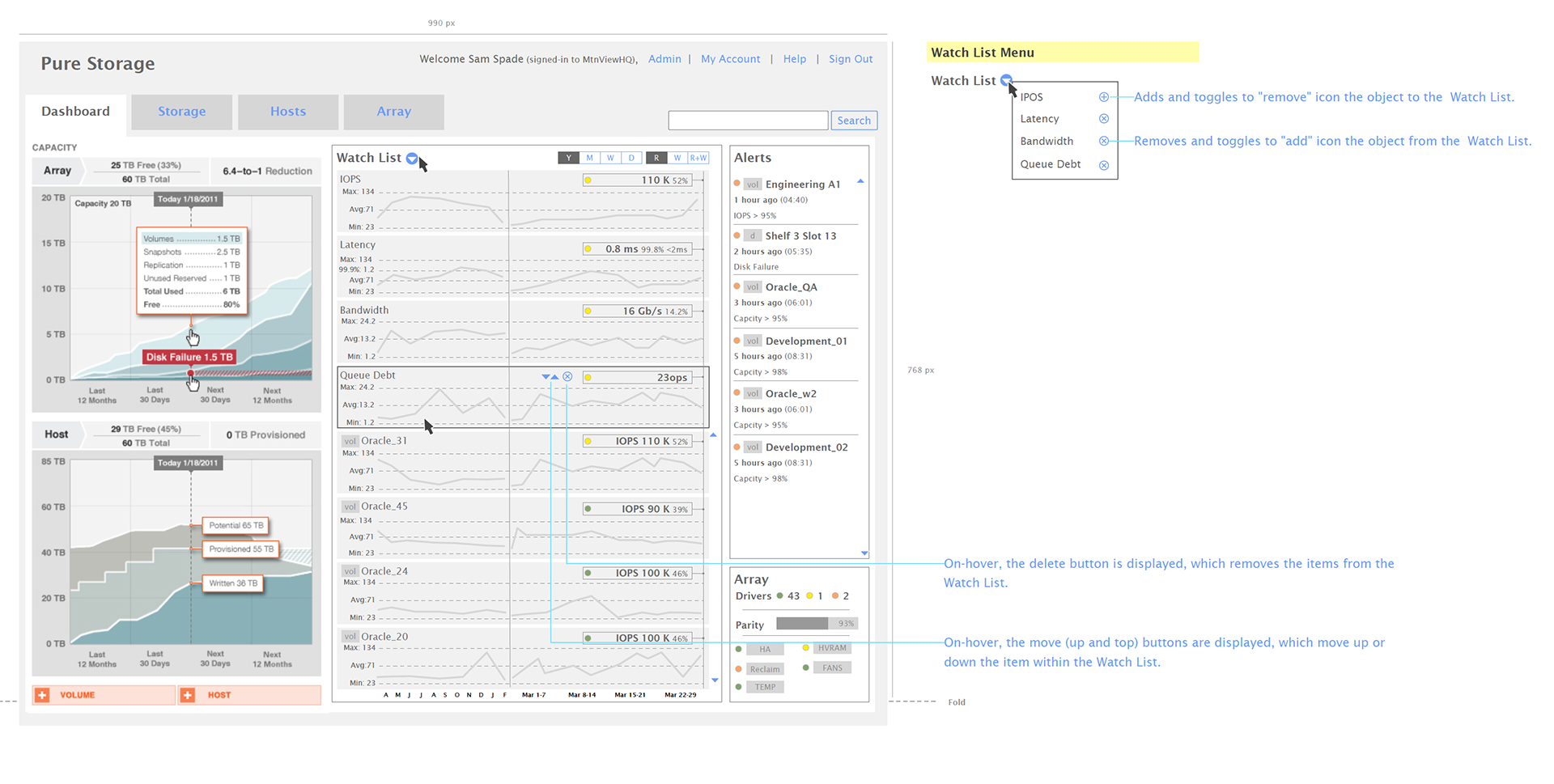
Here are just a very few samples of detailed wireframes we created for the project. When completed, we'd built more than 270 wireframes and iterations.
Starting with Information Architecture, we mapped out and proposed models for organizing functions based on user-stakeholders' familiarity with server management best practices.
In exploring user-models, we literally mocked them up - multiples - so we could evaluate benefits and advantages for each as compared to the other. Of course, through wire-framing, we can be fairly efficient at this. Ultimately, we were able to move forward with a direction that we liked and received good feedback from beta-testers as well.
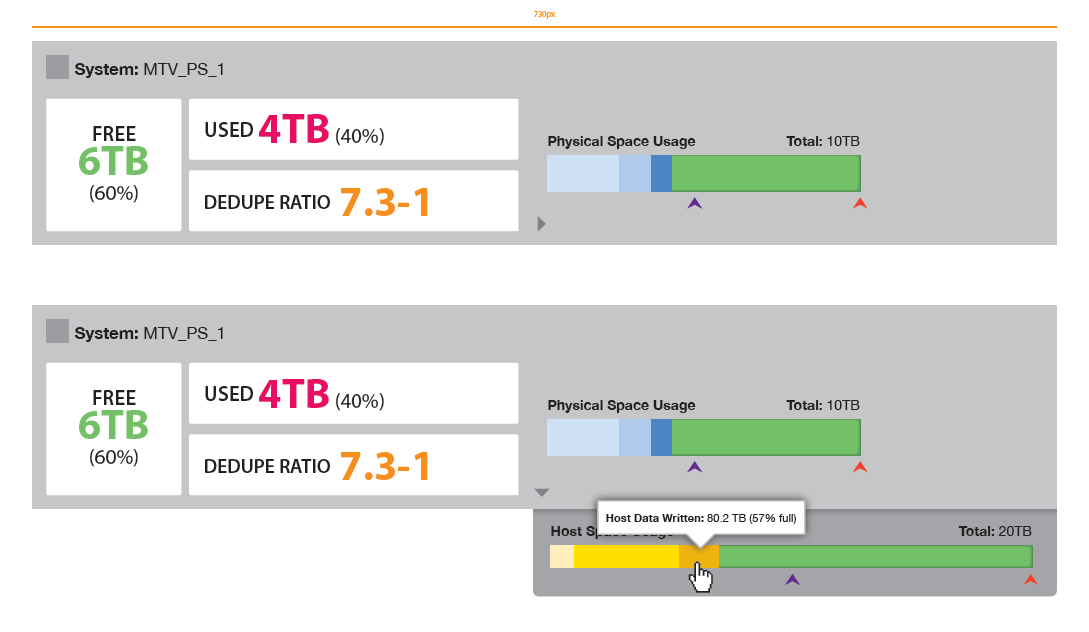
After exploring several different user-models for the UX, we explored many ways to visualize complex data - especially visualizing a LOT of data. Looking constantly at the the complexity of how much information was being displayed and whether administrators could handle more or not. Truly, a balancing act.
We tried to also use conventions that technical admins were used to - but we also wanted to be efficient and push the modern "edge" - exploring new interface metaphors that could help us differentiate the experience of managing a Flash-based storage device vs. conventional and make understanding the data and specifications easier for the administrator.
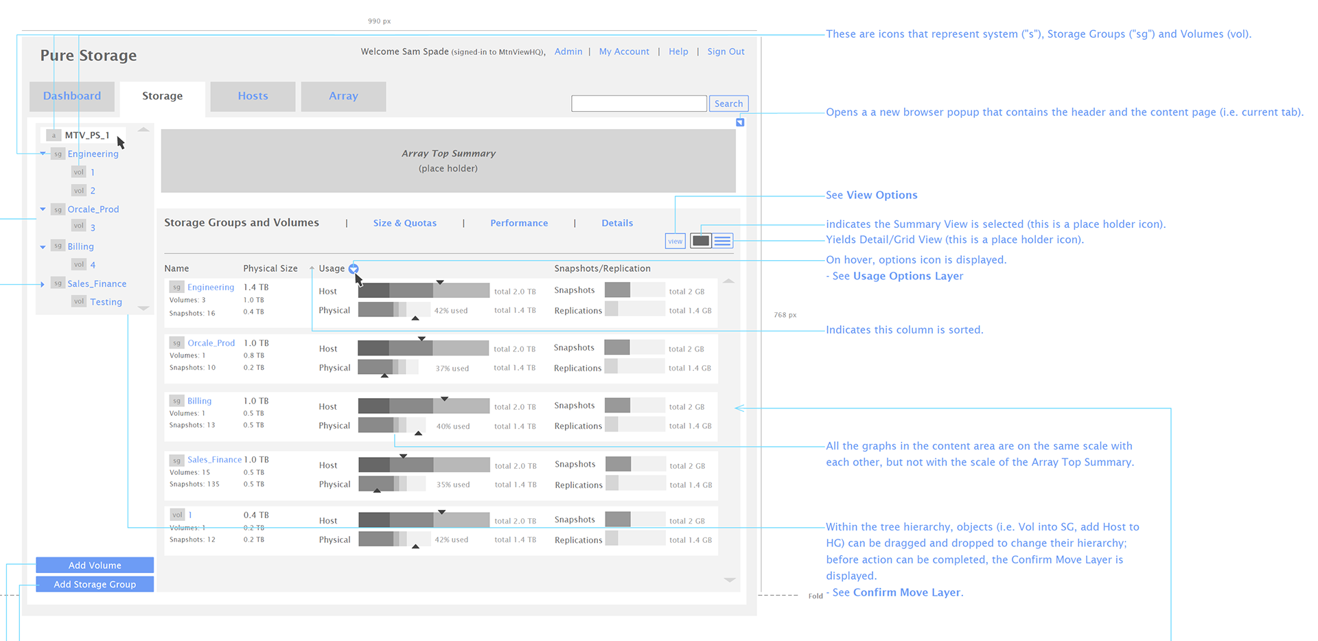
Minutae of interactions were created, revised, and revised again. Nuance was of particular focus for every user-interaction. These were all tested with multiple user-groups that had been established at the start of the project.
Throughout our design process, we try to address every detail we can find. The more we address up front and discuss with engineering to create a understood "language" that they can refer to - means less decisions later that we have to make ad-hoc and more empowered the engineering team feels.
Like many of our interface projects, getting to the visual design phase is really about extending the company brand - into the interface. We also worked to ensure that there is both a strong identity presence as well as supportive graphic language around the interface elements so they are clearly working together.
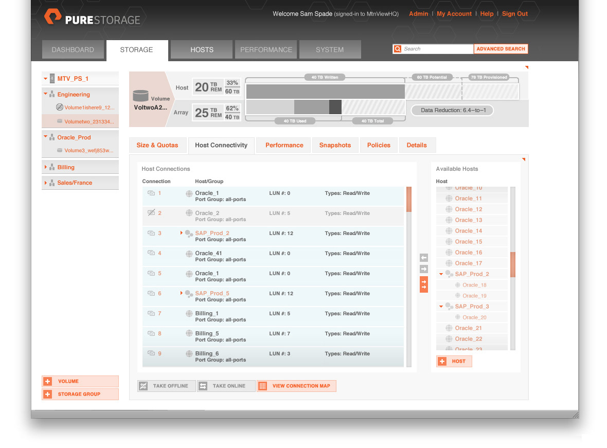
As the interface developed, it became very obvious that the individual memory module and it's complex data and controls would be an essential part of the interface and brand. Below, you can see the deep exploration my team and I went through to explore a range of ways to envision and provide control for the data.

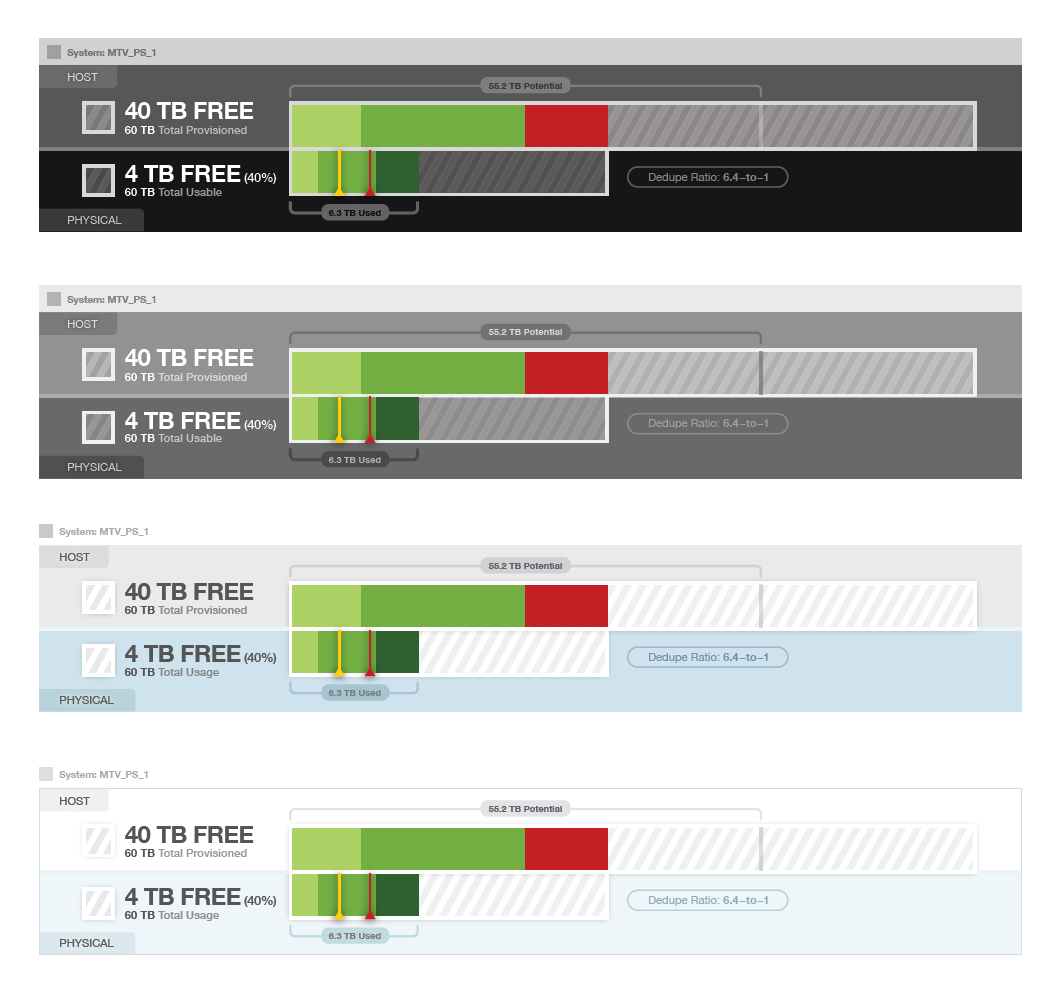

Ultimately, the final design shown below was a product of the refinement of data visualization you see above, along with blending of the identity design color palette as we were developing the brand identity.
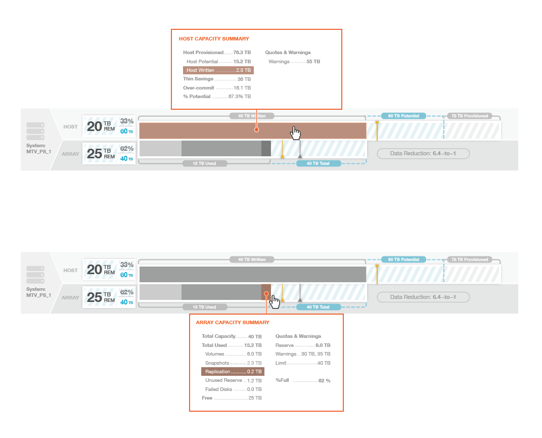
Mapping the final design color palette and developing a distinctive visual design representation of the UX controls ultimately landed us with the following implementation that was met with positive reaction from the user-stakeholders.
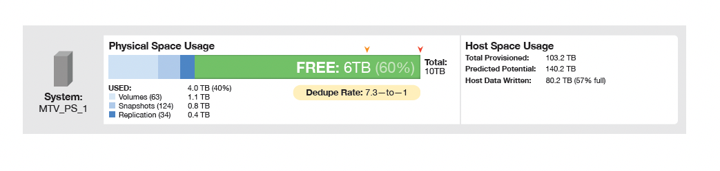
Even interaction details have nuances around color and subtle textures to help emphasize the action that the user can take and data that is actionable.
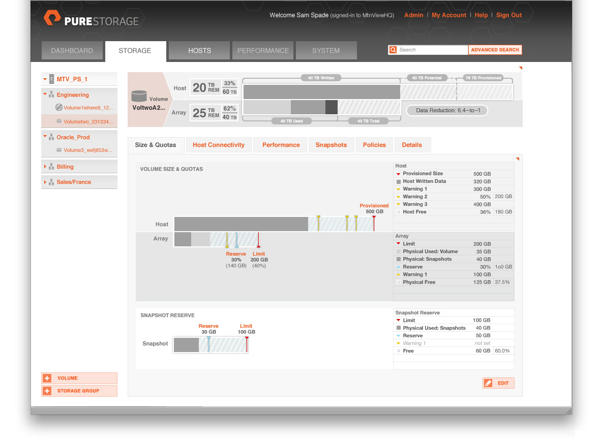
The attention to detail in data panels where settings are critical and the primary focus stand out and then are reflected in the server data visualization at the top.
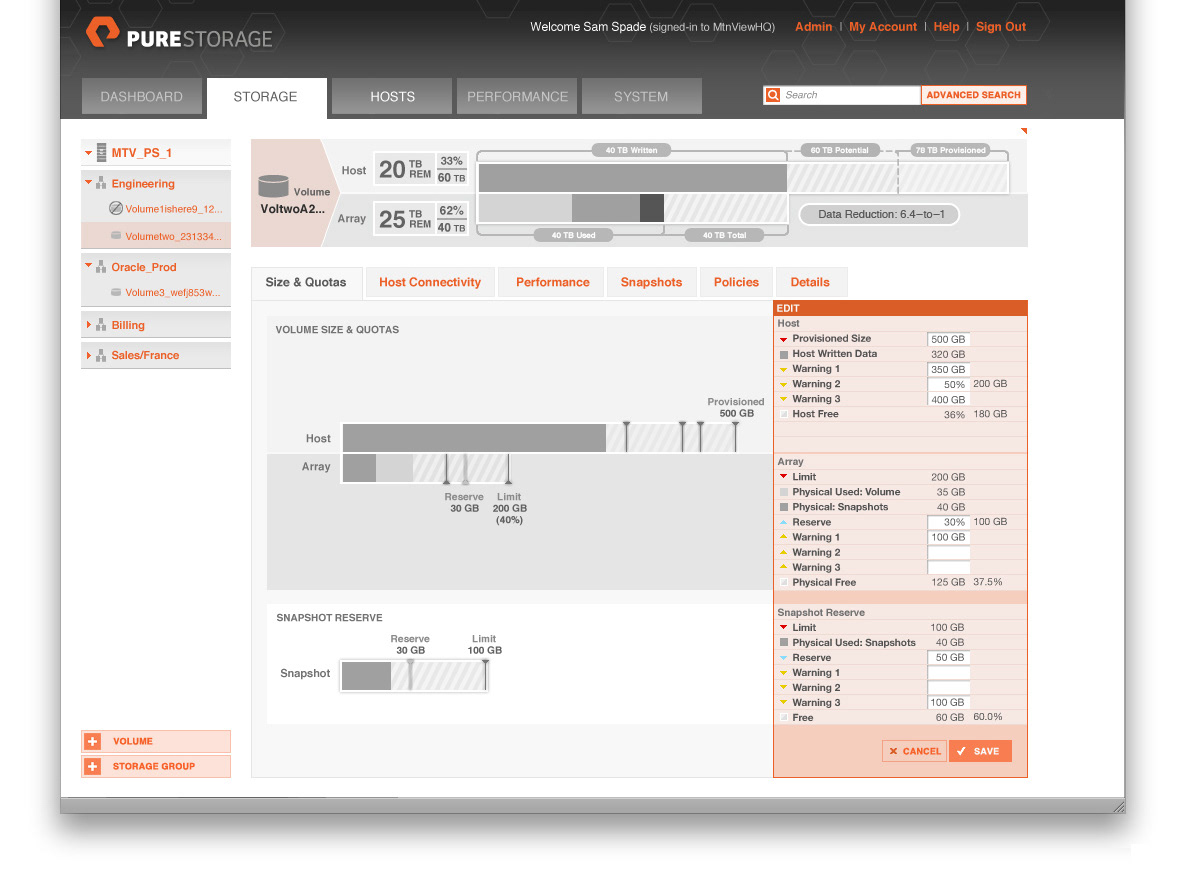
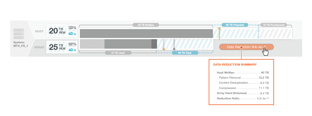
Compactness of information is also considered in the display of text and lists.