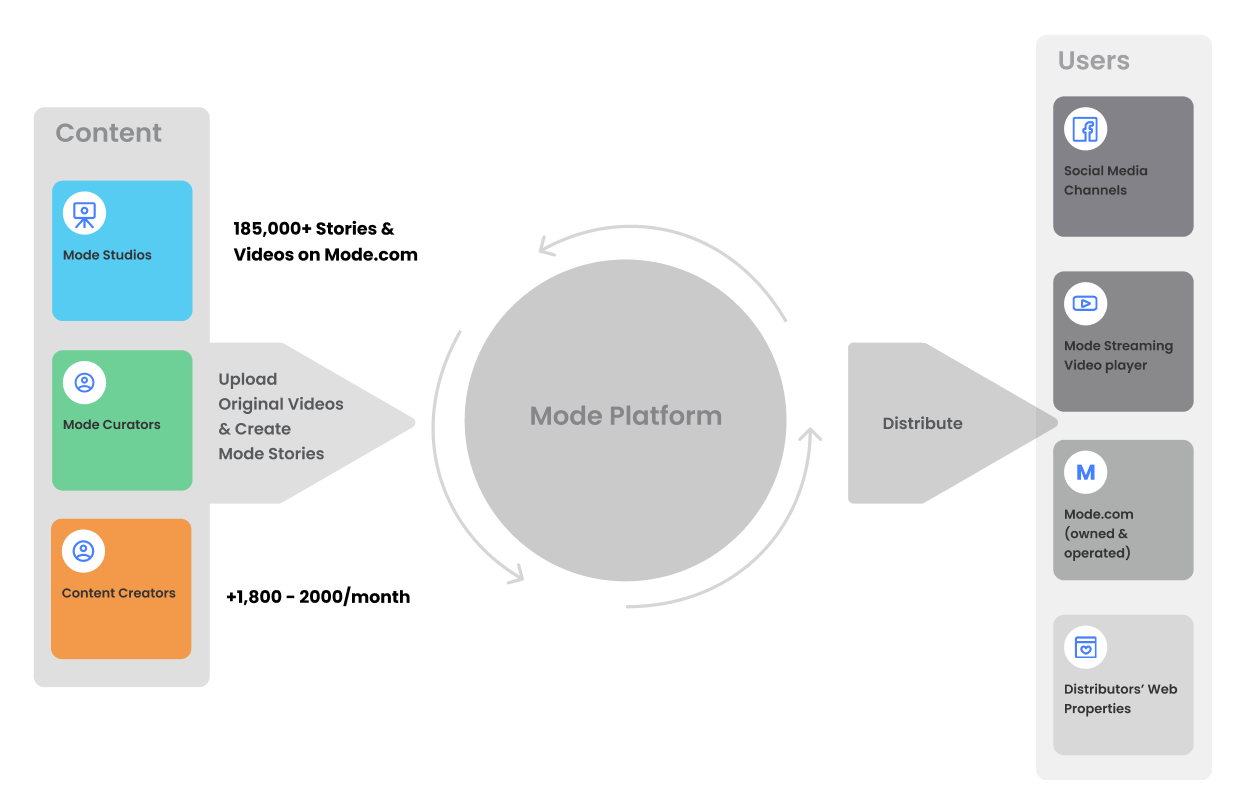
The Mode App is a platform that allows creators to monetize their content - blogs, videos, photo albums, just about anything – by creating stories that thread together their content or other content from around the Web. These curated stories are shared and discovered on the Mode app by consumers interested in lifestyle topics ranging from Style and Fashion to People, Culture & Tech and more.
Advertising is displayed in between stories, as video bumpers and distributed natively on Web content. Creators can monitor performance and revenue generated.
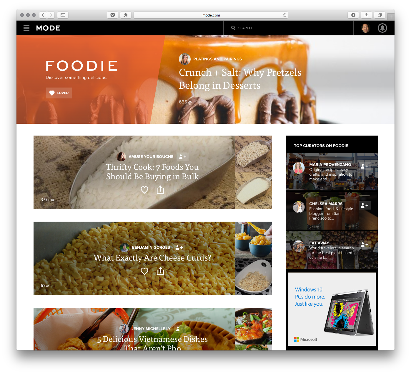
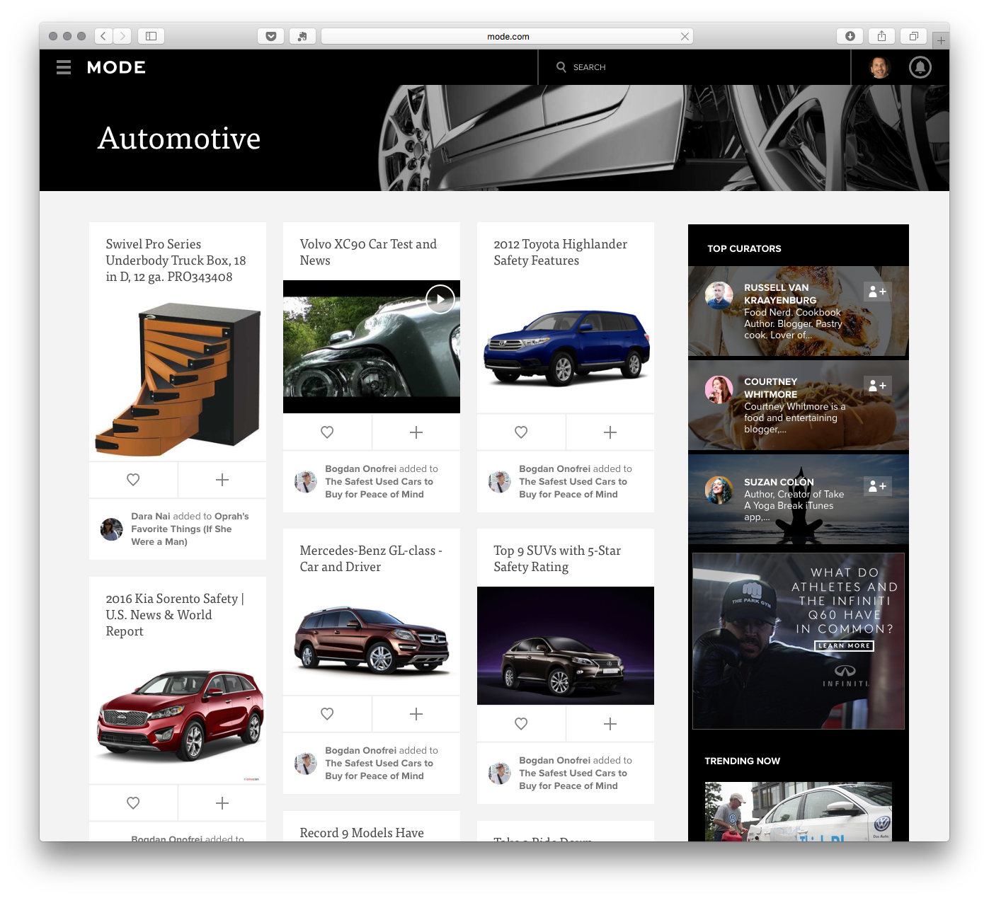
The Web version of the Mode app showcases recent content by channel as well as top curators and trending stories. Creators build stories using the Web Extension.

A significant UX problem was to create a universal viewing experience that could accept any kind of Web content - images, text, video – in any format (often with sub-standard images), and still look compelling to a consumer in the presentation.
We were creating a new form of content organization in which stories could be built in just a few seconds if you had all of your URLs lined up.

On the Mobile app, another challenge in UX was balancing complex navigation between browsing vs. reading as well as browsing within a channel and browsing between channels. All this, while creating navigation patterns that could be easily learned rather than creating a very complex navigation bar.
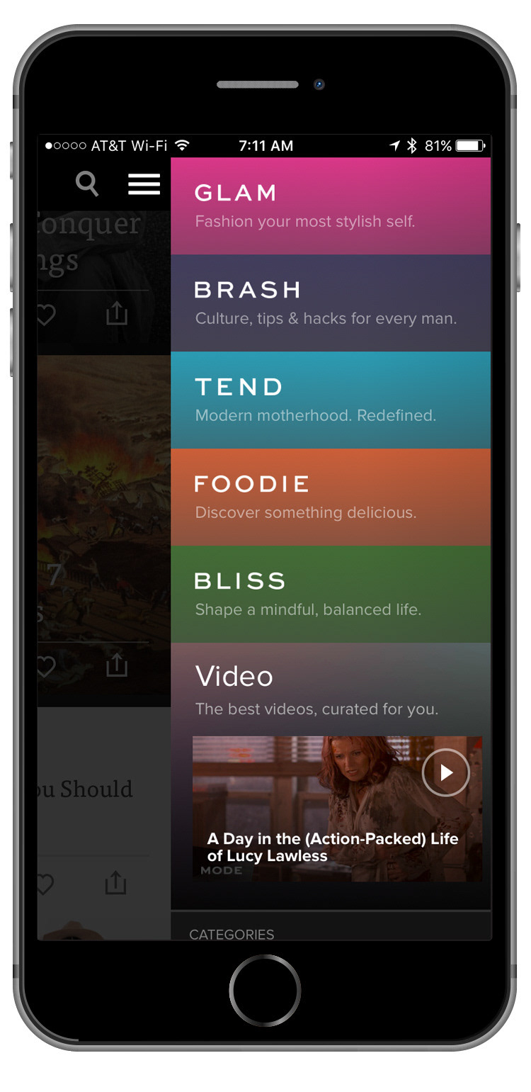
We branded additional categories of content, or "Channels" like Brash (Content for Men), Tend (Family & Parenting), Bliss (Health & Wellness), building upon the initial success of both Glam (Beauty & Fashion), as well as Foodie.

The Mobile Web-app experience had limitations that the native app did not.
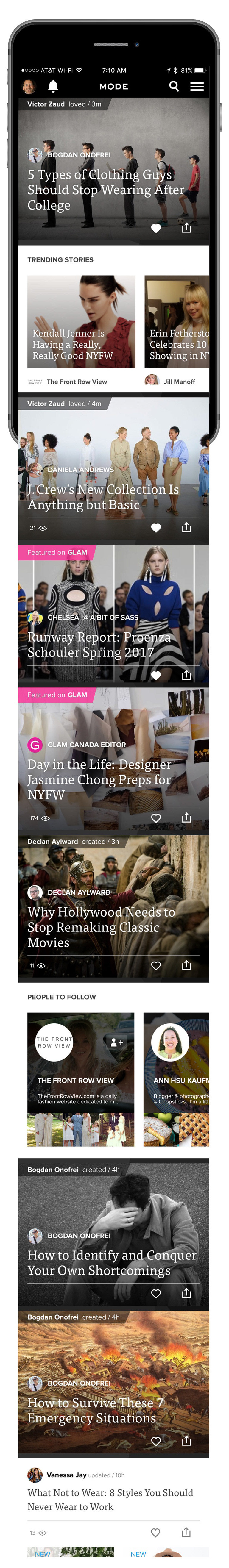
As the content and curation were coming together, the Mode App definitely became more and more compelling with awesome content that stood above in quality compared to News and other random blog aggregator products. The design was lauded for it's visual simplicity but also drove engagement with posts often drawing hundreds of comments and outbound shares.

How to create navigation that would work with mobile users habitual patterns taken from Tik-Tok and Instagram was our goal to make moving around to explore stories easy. We studied user-behaviors and tested many different ways to scroll and swipe before we agreed that this was the best model.
Users choose a content channel, like GLAM in this example. Then, they swipe through featured stories with the GLAM "flag" still reminding them of where they are. Once they see something to read, they scroll down to reveal the full story.
In creating a search-experience, I wanted to encourage discovery at every stage. Today, you see this practice very common on Streaming services when searching for content. Each stage of the search-experience is providing options for things to choose before you even decide to type something in.
With the strong belief that we were creating reasonable swiping patterns for users to help maximize ease of navigation, I didn't want to chance anything and so created this initial state of the app where we'd show these "coach-mark" animations for the first app-start.
The Foodie "channel" became so popular, we created a whole separate app for Foodie and focused on video recipes and special interest features.
I created this promo video for Creators and how to use the Mode Browser Extension to build stories. This was the first time we'd fully played out the user-experience in a very accessible form.
One of the single most crazy challenges was how to balance presenting Advetising in a way that didn't disrupt the viewing experience, yet still was attractive for revenue.
Here is an advertising bumper playing ahead of a piece of video content in a DIY story by the Glam Editor.

We needed to develop genres of content (or categories) beyond the primary channels to help users browse easier. My team created category templates to be a simple "Pinterest-esque" cascading waterfall of posts that users can easily scroll through to see the latest and trending stories easily.
Getting the context for the post is easy, and then clicking takes you to the familiar story detail page.
Video interest was growing faster than static content stories, so we created the Video section, which was more "media type" than category. Integrated content ads that played before the video content was also a significant revenue driver.

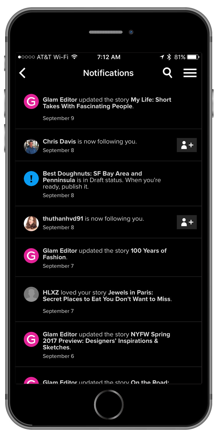
For me, in designing the notifications page, it had to be incredibly functional so users saw only the necessary information about new stories from channels and people I am following.
Only CTA's for following people or channels I'm not already following.
Content is promoted & distributed throughout the "ecosystem" of connected creators' sites as well as social channels. At the time, in 2016, you can see on Facebook - 563,000 page likes; millions of distributed engagement. From videos to stories.