The Funler Teaching experience was a project to improve existing functionality for a digital platform that allows teachers to organize and monitor in-class curriculums, grading and student performance.
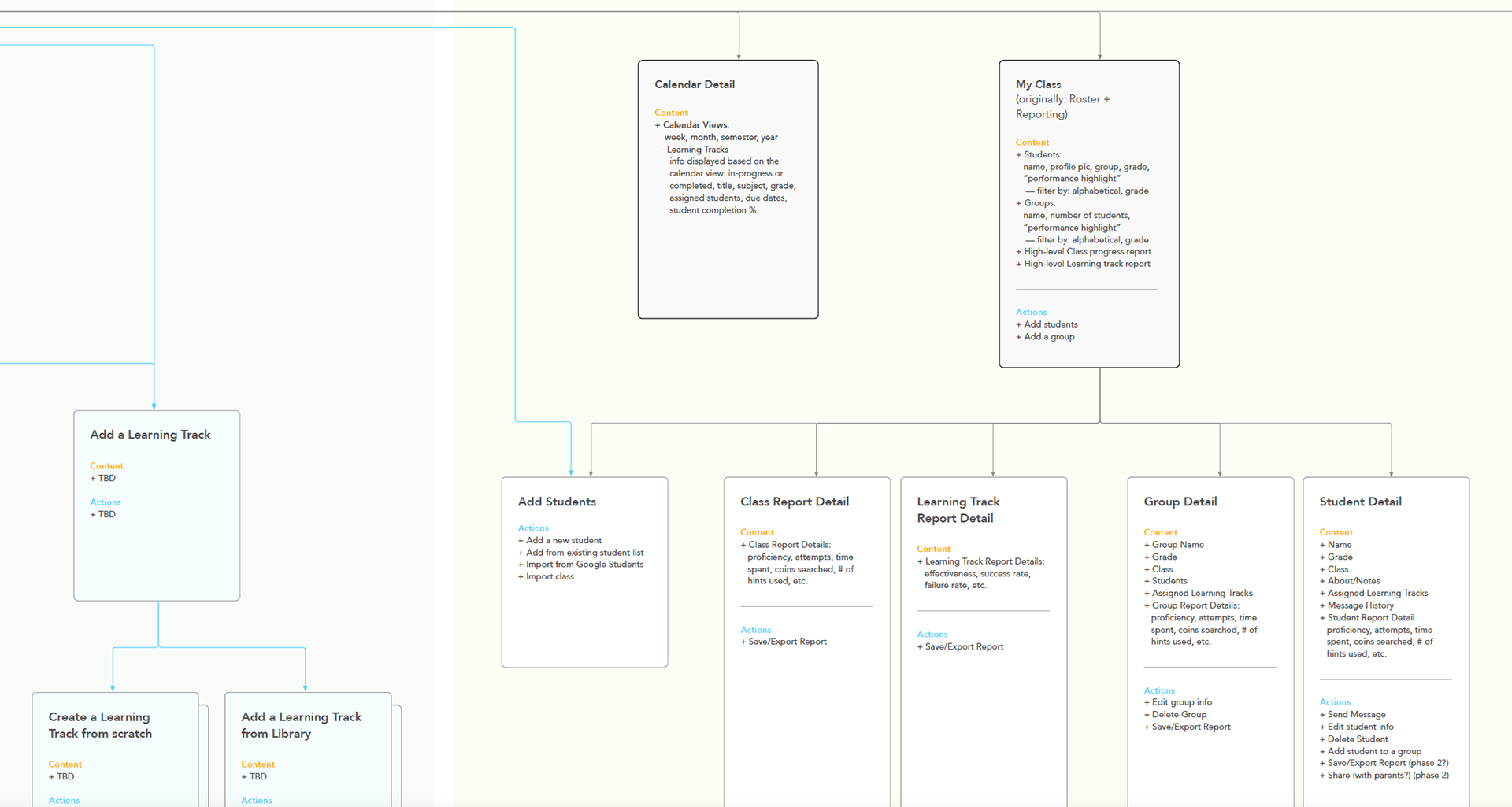
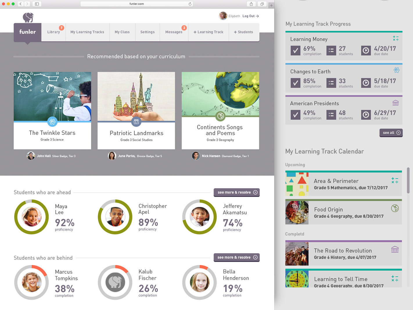
My work started by auditing the existing platform and proposing ways to improve the core organization of functionality. This Information Architecture summarizes the new organizational model we proposed. As the product is centered around "Learning Tracks" or educational curriculums, I proposed a high-level structure that focused on Share & Onboarding, Content, Content Creation, Students, and Utilities.
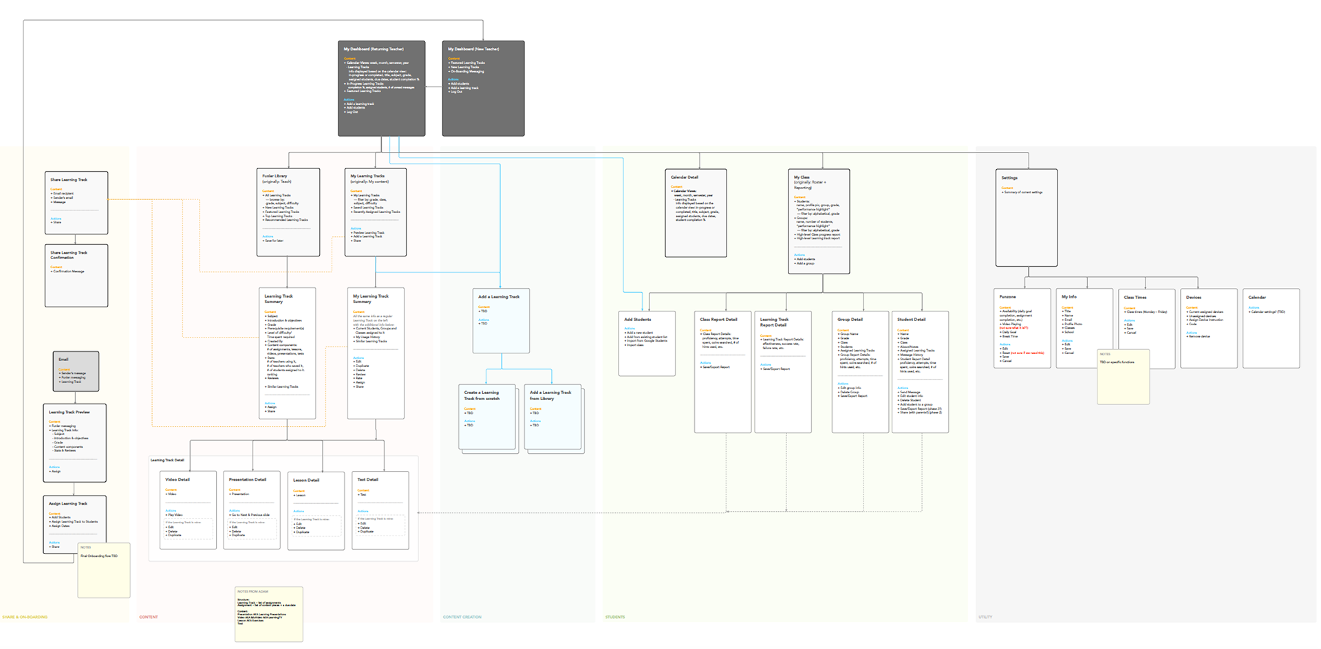
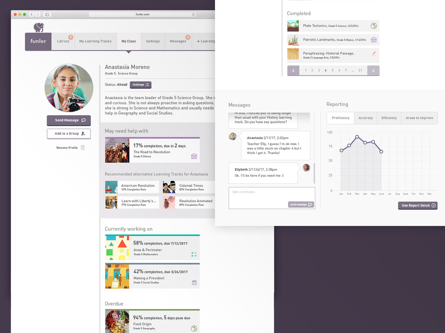
Further, organizing controls for managing students, report details as well as group details under a master Calendar as well as the My Class section.
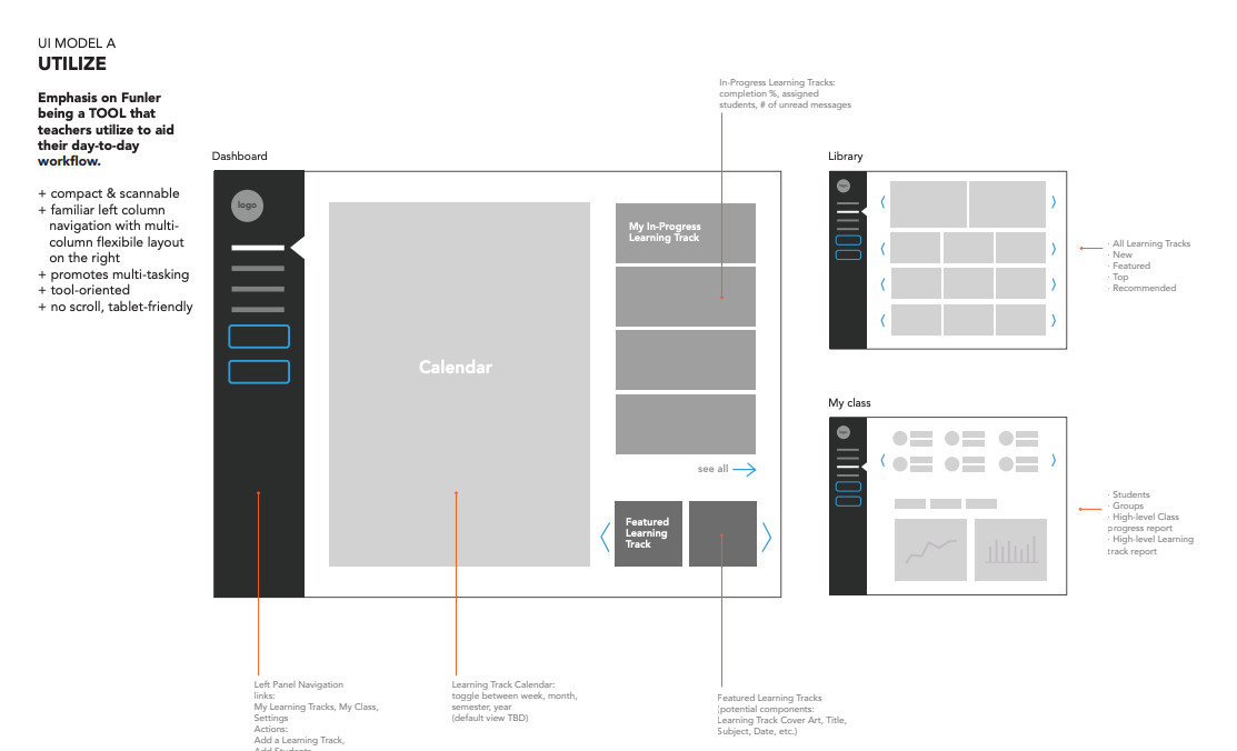
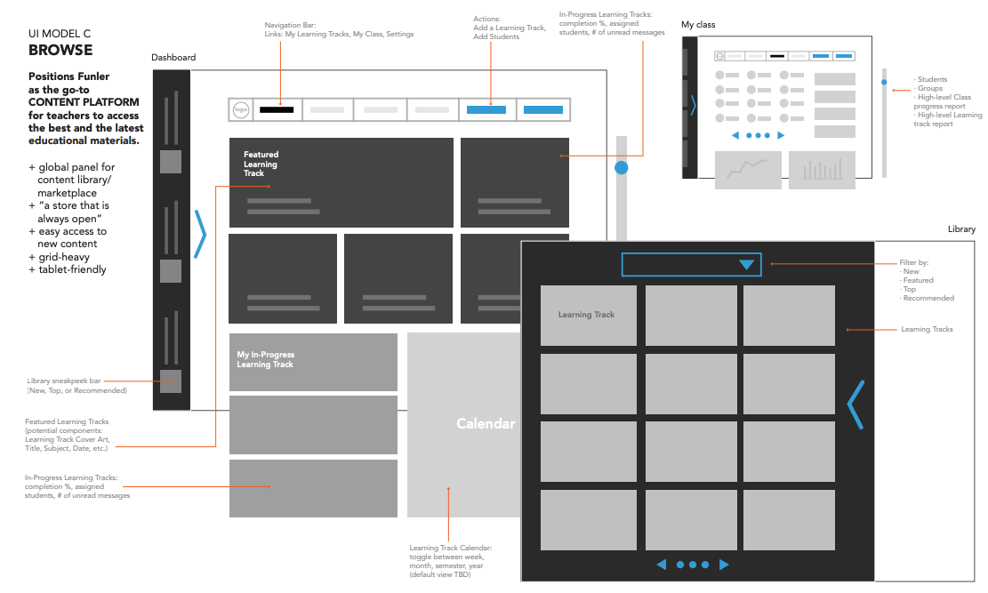
In exploring different possible "user-models" for engagement, I looked at 4 possible contexts for engagement:
1. Utilize - Emphasis on Funler being a tool that teacher utilize to aid them
2. Monitor - the insights solution for teachers that provides data & info
3. Browse - A content platform model for easy access to the best content
4. Build - Engage & create personalized agendas & materials
2. Monitor - the insights solution for teachers that provides data & info
3. Browse - A content platform model for easy access to the best content
4. Build - Engage & create personalized agendas & materials


The Funler Dashboard became the user-model most suited to satisfy the core user-needs for the project.

For visual design, we developed a new identity (elephant & lowercase typography) along with a very neutral visual design that could help elevate and showcase the curriculum datapoints and content graphics.
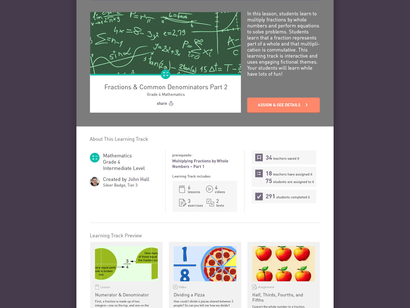
Core functionality and process screens follow a solid purple background with grey foreground process steps and occasionally secondary white-backed content, like other learning track previews.
Messaging and feedback with Students would have rich information about the section and status of work completed, so teachers would have the most information associated with their questions.
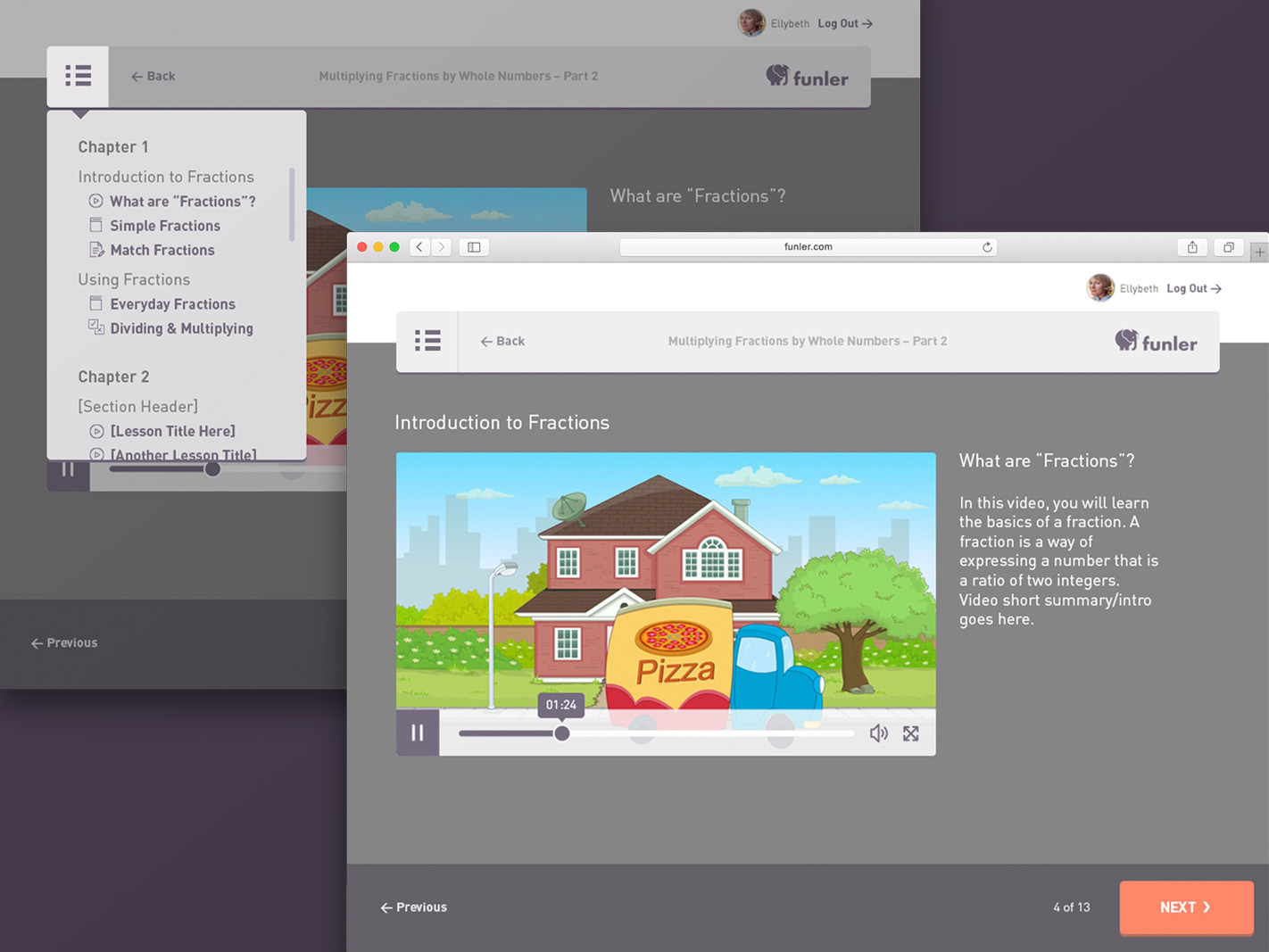
Functional areas of the user-experience would always have the consistent grey background and simple process summarized - represented differently than the core dashboard or content information.
Finally, reporting details are represented in the primary identity colors of dark purple and grey - to shift the overall language of data vs. content for the user. I wanted the data visualization to feel both incredibly clear and prioritize only the proficiency % and the trend lines, so at-a-glance, there would be high-value.
