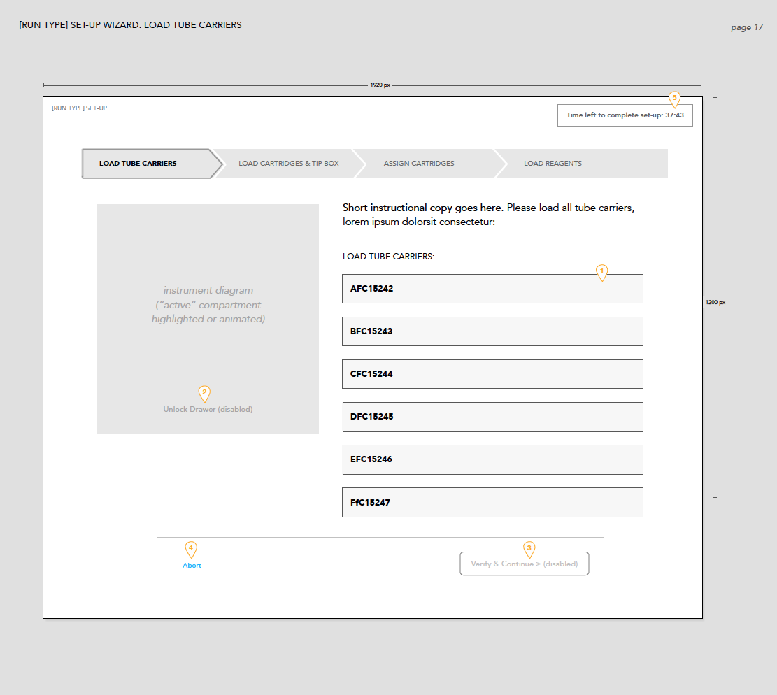
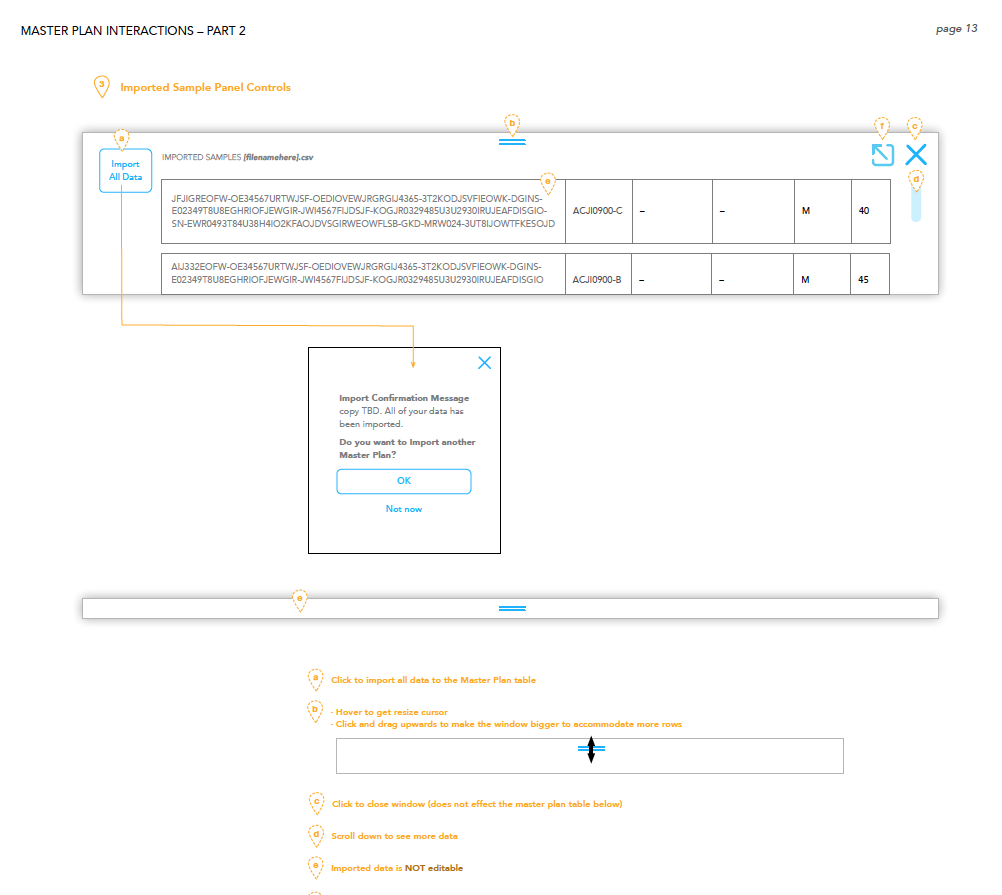
As with most of our product design projects, we are involved at the very start of every project, mapping out requirements, developing user-model options, task-flows, and more - working directly with Product Leads and directly with engineers to ensure there is alignment with design.
Here are a few initial UX wireframes and task-flow examples that preceded the visual design work.
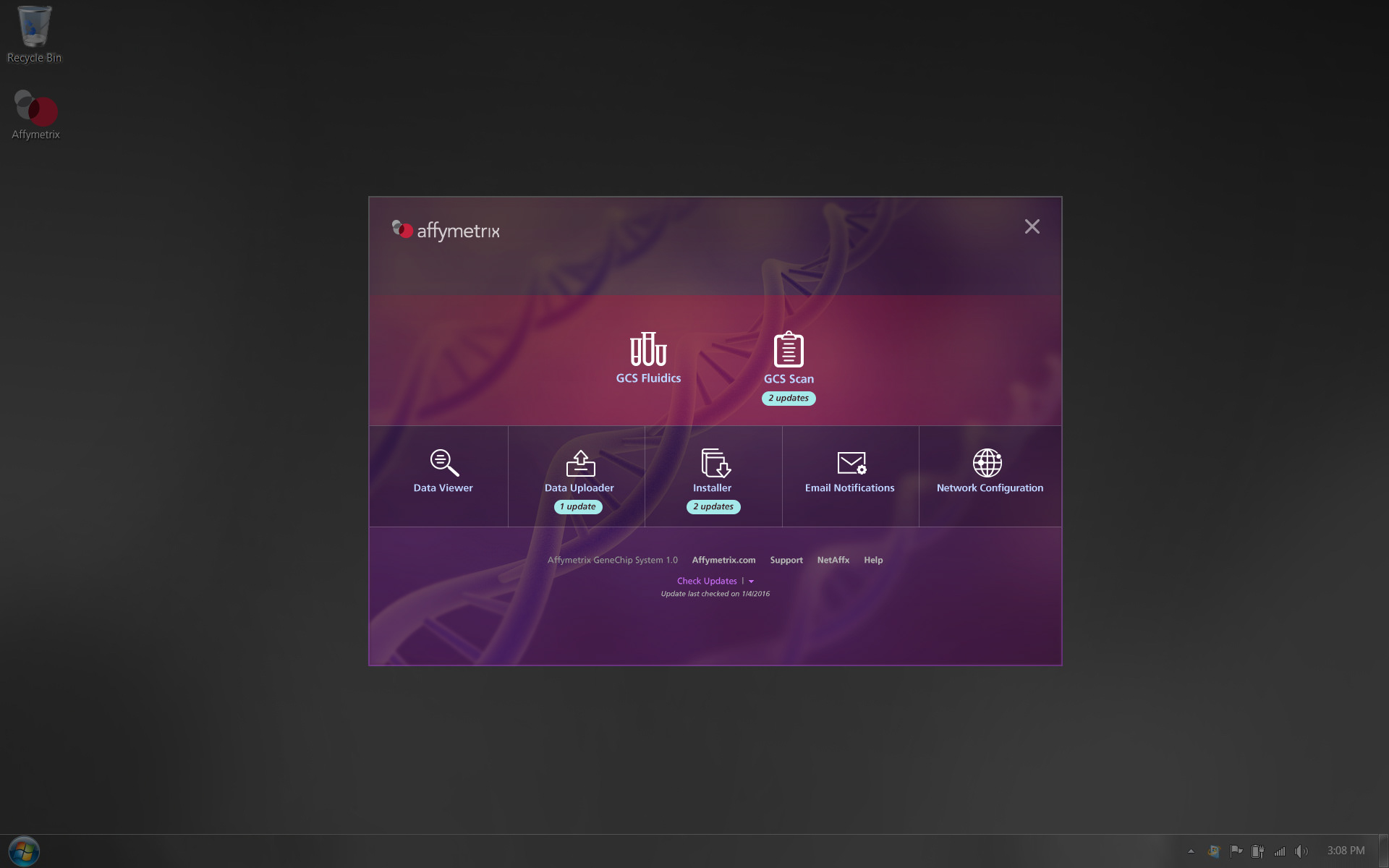
We believe strongly that a company's digital product is a direct extension of the overall company brand. Many of our digital product solutions have helped shape a company's brand through the visual design we do. In this example with Affymetrix, the design of the product we created pushed the overall brand identity of the company to evolve.
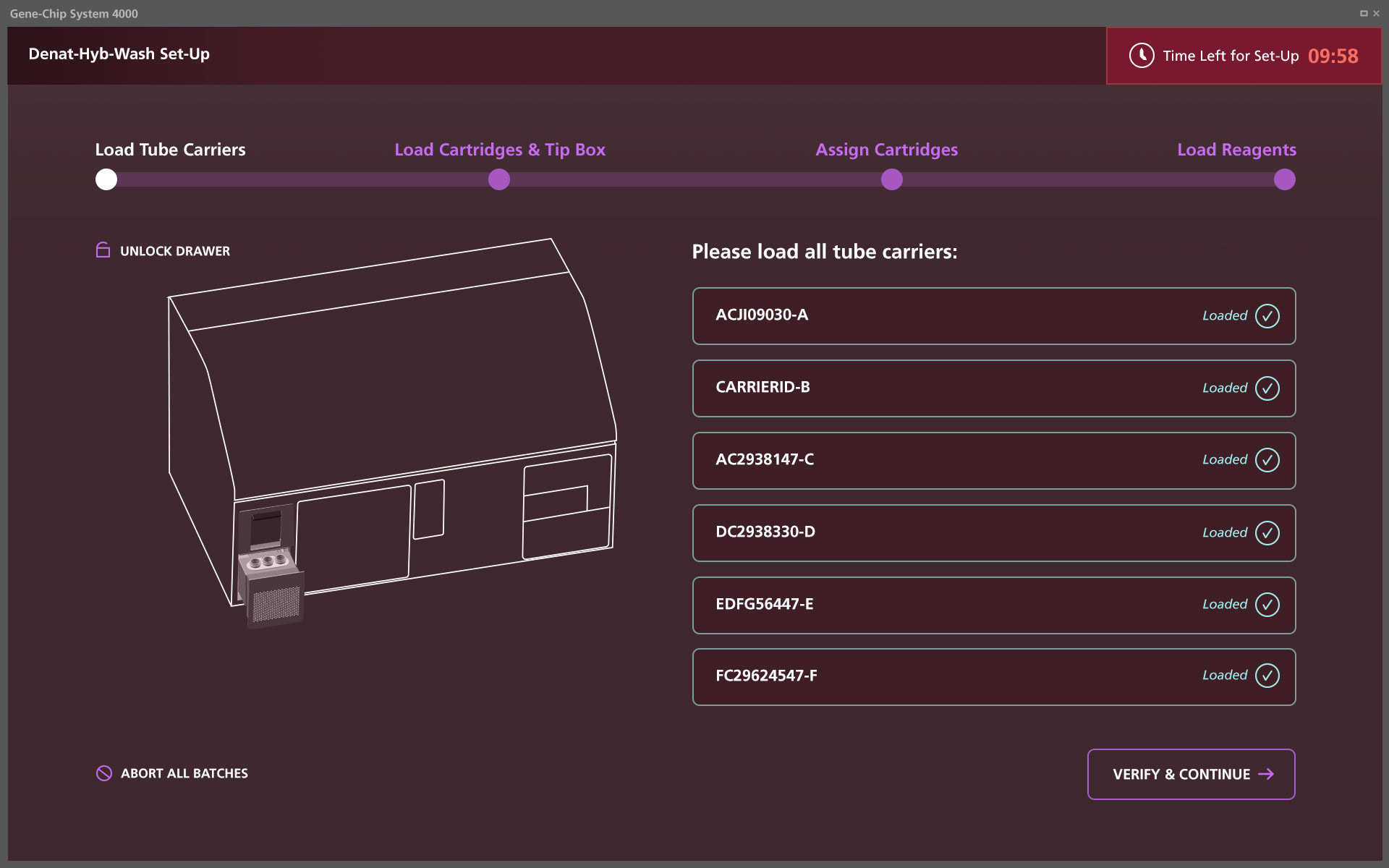
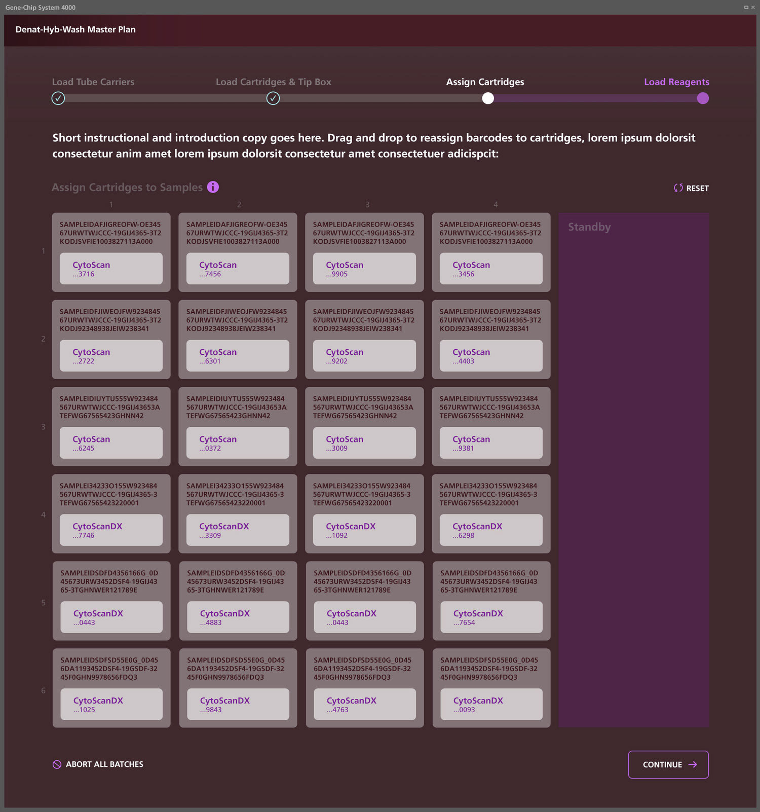
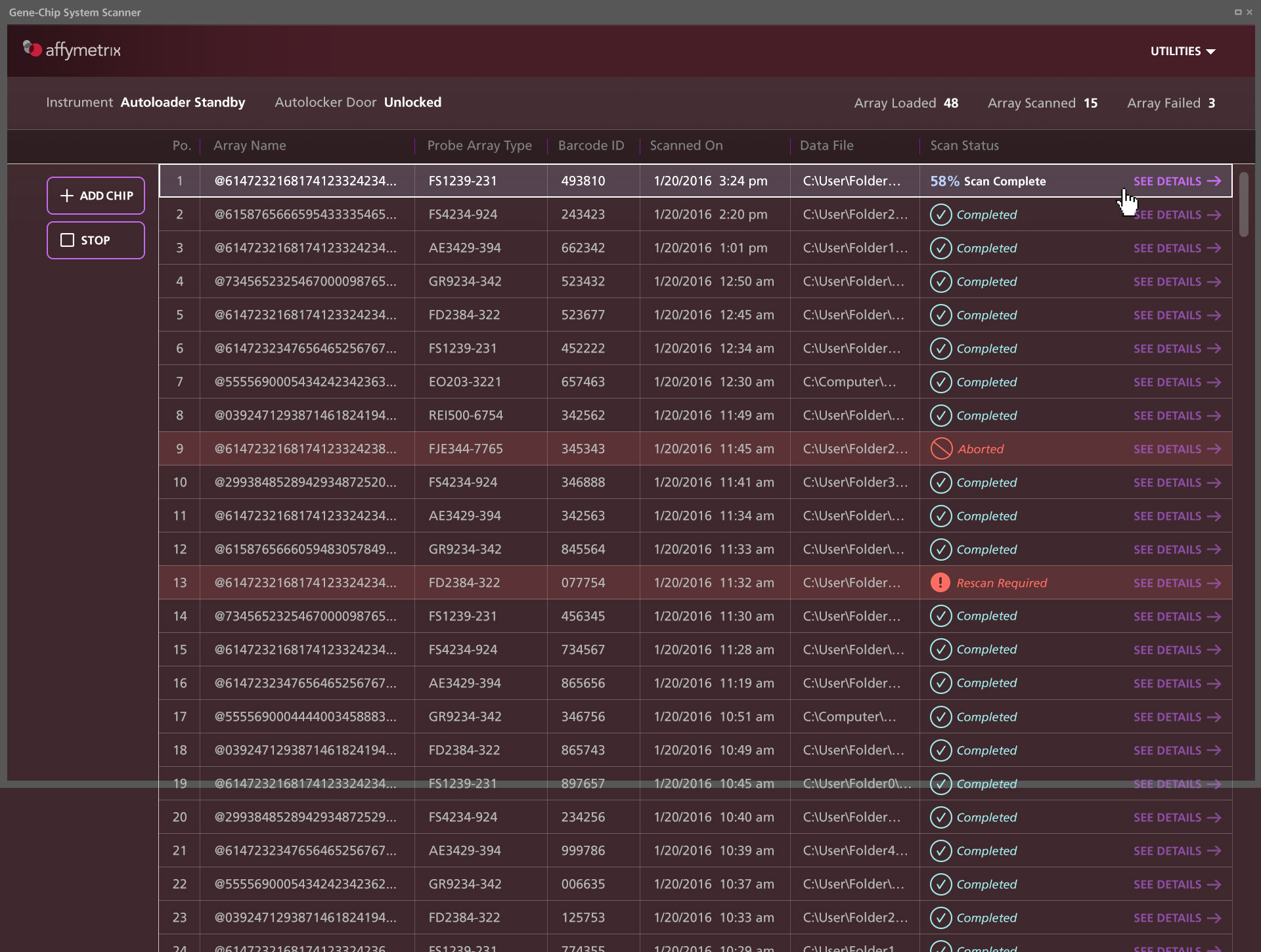
My team and I developed several visual directions - vastly different - prior to moving forward with a final design style. In this case, the most successful design for our client was this "dark" version that helped clinical scientists see critical data points faster in user-testing.
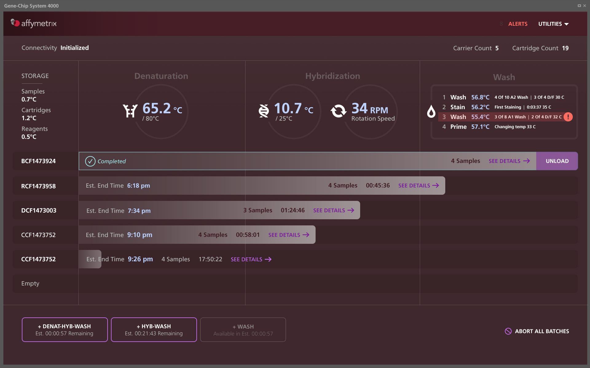
In reports and status screens like this one, it was much easier (in a lab environment) to read multiple pieces of data in a single screen with this approach to visual design.

Here, too, the buttons were very obvious to see which items were complete vs. selections that needed to be chosen.

A progress indicator consistently represented at the top of the screen helped orient users to each step of the process and helped set expectations & confidence for using the product.